At Rootsteps, we are proud to share our work for Café de Buren. We've designed a user-friendly website that perfectly matches the warm and inviting atmosphere of this cozy cafe.
Datum van oplevering:
1/4/2024
Locatie:
Hellevoetsluis
Budget:
5K
Branche:
Horeca
Cafe de Buren

Over de klant

Introductie

At Rootsteps, we are proud to share our work for Café de Buren. We've designed a user-friendly website that perfectly matches the warm and inviting atmosphere of this cozy cafe.

Over het project

What we did:

  • Menu card: Clear, scrollable menu with subtle animations, optimized for mobile users.
  • Homepage: Interactive home page with a moving steak that follows the mouse, providing a unique and playful experience.
  • Integration: Seamless integration with Zenchef (formerly Formitable) for reservations.
  • Design: Dark, warm design that reflects the ambiance of Café de Buren.
  • Photography: Collaboration with Maria van der Valk from Live Photo & Film for beautiful photos.

The history of the restaurant is shared with the visitor. The layout is playful and contains a little bit of salt here and there for decoration.

Bij binnenkomst op de website zie je direct dat in dit restaurant steaks geserveerd worden. Dit is belangrijk voor de doelgroep. De steak volgt de bewegingen van de muis. Op mobiele apparatuur is dit effect sterk gereduceerd maar nog wel te zien door ergens in het scherm te tikken of bewegen.

The playful offset format is also used here to announce events.

This is what the menu items look like. You can clearly see which category you are currently in, the wines have a price per glass and per bottle. You also see the country of origin and a nice description.

This is what a dish on the menu looks like.

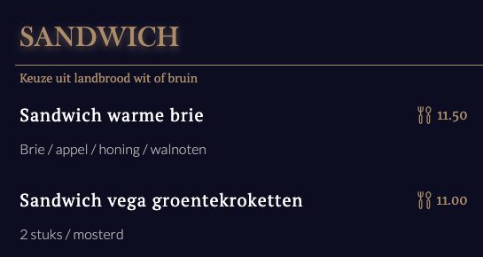
A clear menu simplifies the choice when booking

Creating an easy-to-navigate menu is the most common thing about Rootsteps. We digitize the menu at no extra cost and bring each dish into perspective on the website. That's why restaurants are particularly well off with our service o

Because we efficiently migrate all restaurant menu items to the online world without worries. As a result, the menu items are easier to find, read and accessible. After all, people who are visually impaired or digitized can't do anything with a menu in PDF. Increasing accessibility also makes it easier to reserve and order.

De menukaart laat op alle apparaten duidelijk zien welke categorie men bezoekt door de categorie altijd bovenaan weer te geven. Een sticky effect wat handig van pas komt om de gebruiker/bezoeker goed te laten oriënteren in de menukaart.

Als je in de menukaart naar beneden scrollt worden de nieuwe items, die je nog niet gezien hebt subtiel geanimeerd om bij te dragen aan 'de user experience'. De bezoeker/gebruiker kan op deze manier beter oriënteren en de interacties/animaties dragen bij aan de oriëntatie op de site.

Website kenmerken

Acquisition of customers via the website
Animations & Interactions
Custom-made design
An overview of products
Kalender met events
Template design
Recruitment via a vacancy list and vacancy page